Words for Color
Names, Nomenclatures, the Problems of Black and White
1Cologne earth and Cassel earth are pigments, brown-colored coal- and peat-based earths, associated with two regions about one hundred miles apart. By the eighteenth century, one color was understood to be darker than the other, but whether it was Cologne or Cassel earth fluctuated. Other names include Colens earth, Cullens earth, terra di colonia—all variations on Cologne earth—and Vandyke brown. The latter name connects use of the pigment to the Flemish painter who worked in England during the seventeenth century; still another name, Rubens brown, links it to Van Dyck's teacher.1
 Jacob Christian Schäffer included the red colors Florentinerlack and Kugellack in his color classification system. Each is defined as a carmine lake, and published instructions to create them are similar; Schäffer also includes carmine in his hierarchy of red colors.2 Schäffer's system suggests that the three are separate colors; did he learn their differences from his color merchant? Did he believe they were inherently different colors even though they all resulted from the same production process, or was he unaware of this?
One pound of cudbear will dye three pounds of wool a good pompadour, and nine pound does the same to twenty seven yards of superfine cloth.
Cuthbert Gordon to the Chemistry Committee 26 May 1761 [R]SA Guard Book PR.GE/110/11/4.
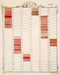
Cuthbert Gordon's petition to the Society of Arts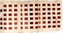 included seventy-eight different samples of colors made from his discovery, cudbear, and he noted that certain quantities of this coloring material would make pompadour color. reference As a name for a color, pompadour first appeared in England in the mid 1750s. Although the color was found on objects created in France, the use of the name in this way was not common there until the nineteenth century.3
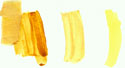 Originally a natural yellow-brown cotton cloth native to China, nankeen, as eighteenth- and nineteenth-century references to it suggest, was a fashionable color created in the dyehouse. A similar color—occasionally it too was called nankeen—is found among contemporary pigments and pottery glazes.4 Recognizable to a connoisseur, nankeen is a difficult color to describe; what it looked like depended to a great extent on the fashions of the moment. It ranged from a very pale yellow to a color approaching that of a good English mustard, often with a greenish undertone, often made with turmeric. The range of colors that could be indicated by the name nankeen overlapped with yellow colors that bore different names, suggesting, despite its origins, that nankeen was the name of greatest value to merchants rather than to manufacturers.
Le nom qu'on donne à une substance doit naturellement la présenter, de maniere qu'il n'y ait aucun doute, & qu'en la dénommant, on puisse en même-tems se faite entendre.
Jean-Félix Watin, Supplément (Paris, 1773), 46.
These examples suggest the nature of a problem recognized in the eighteenth century and one that is no less of a problem now: the problem of defining color names. reference Even when we disregard the vagaries brought on by color vision, the identification of colors is confusing in its subjectivity. Names differ by language, region, producer, preparation methods, and occasionally the whim of a merchant. reference Different terms can indicate visually indistinguishable colors and, at the same time, one name might be used for dissimilar ones. The lack of a vocabulary stable over time and geography and the lack of a universal system that creates a one-to-one relationship between color and color name, are not insurmountable problems, but they do highlight the need for attention to words for color common in the eighteenth century, and the concepts those words expressed.
Die rothe farbe ist also eine elementarische Feuerfarbe, und die blaue ist eine elementarische Wasserfarbe. Aus diesen zweien elementarischen Hauptfarben entspringen hernach alle andere Farben.
Nemlich die gelbe Farben haben ihren Urspring aus der rothen elementarischen Feuerfarbe, und sind anders nichts, als eine Verdünung und Verminderung der rothen Farbetheile, mithin eine ins helle sich verlierende Schattierung vom rothen.
Die grüne Farbe ist eine Vermischung und Zusammensezung von blau und gelb, und entstehet in der ganzen Natur anderst nicht als auf diese art.
Die violette oder Purpurfarbe ist wiederum anderst nicht zu erhalten, und in allen Körpern der Natur anzutreffen, als durch eine Vermischung und Zusammensezung von den zweien elementarischen Hauptfarben, der rothen und blauen.
"Kurzer Inbegriff und Auszug einer neuen Farben-Theorie," Schwäbisches Magazin von gelehrten Sachen auf das Jahr 1776 (January 1776): 3–4.
The solution, like the problem, extends in several directions. We need to recognize assumptions in modern and casual descriptions of color, assumptions that can mask subtleties that may not have been at all subtle in the past. Homer's wine-dark sea is one example of how earlier perceptions can be different from later ones, confusing to those unaware of the ancient Greek tendency to describe chroma rather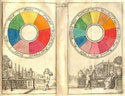 than hue.5 Another kind of change in nomenclature is demonstrated by the term pink. In the seventeenth century, and into the eighteenth, pink was a shade rather than a color proper: brown pink—a color resembling nankeen—was not a contradiction. A similar problem in modern American English is the tendency to consider purple and violet synonymous, as simply red plus blue (r + b): If a distinction were made, purple would be said to be the darker color. In eighteenth-century conventions, purple has more red (r + r + b) and violet more blue (r + b + b); one can have light and dark violet as well as light and dark purple. Recognizing their separate gradations and scales explains eighteenth-century discussions; the differences between colors such as prune Monsieur and purpre l'Eveque, for example, are incomprehensible without this understanding. And, occasionally, a common color name changes meaning. An example is the French term aurore. During the seventeenth and most of the eighteenth century, it signified a yellow with light red tones, whereas today it suggests a yellowish light red, a cream-of-tomato-soup color. Its shift in meaning began in the early nineteenth century and can be traced through painting instructions in English and German as well as French. The French chemist Jean Hellot noted a similar shift in the color scarlet. reference
Allied to the problems of color descriptions are several questions based in explanations of black and white. The convention whereby the successive darkening of a color is described as the addition of black, while lightening is described as the addition of white, held true in the eighteenth century. Authors of practical treatises on color may ally their work with contemporary physics and refer to the darkness and lightness of colors, meaning shades and tones, but often they are referring to color created through the mixture of pigments. Furthermore, black and white are not colors in physics and yet colormakers can produce them, often using processes or techniques that parallel those used to create true colors. Colormaking conventions enable one to see different shades of white and black, shades that cannot be seen in physics. Black and white were often excluded in philosophical discussions of color but were always a component of the operational. How were these differences reconciled in the eighteenth century? reference reference reference reference
^topColor Nomenclature in Practices
If Mr. Bardwell had known, that the four colours mentioned by Pliny were no other than black, and white, and red oker, and yellow oker, he would have known . . . it was not only impossible to compound blue, green, and purple from these colours, but even the tints of a tolerable carnation, or flesh colour: much less, that out of them the antients made all their teints.
[James "Athenian" Stewart] "[Review of] Thomas Bardwell's Practice of Painting" Monthly Review 15 (August 1756), 167.
Most eighteenth-century explanations of color identify some small number of fundamental colors. There were several reasons supporting this practice, derived from classical and later physics, from dyeing and painting techniques, and from common social and intellectual exhortations to strive for simplicity in the description of natural systems.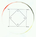 The visible world offered inconsistent clues about what that number of colors might be. reference A tidbit of information that had entered the folklore of color by the eighteenth century—one recurring in eighteenth-century writing as frequently as the characterization of glass painting as a lost art and the need to rediscover Tyrian purple—was the assertion that the antique palette had only four colors: black, white, red, and yellow.6 This number contained a neat correspondence to the four humors and the four elements, and discussions of this limited palette appear to have had greater influence on eighteenth-century efforts to trace a history of painting or on philosophical and aesthetic studies, than on the development of any practical technique. Blue, despite knowledge of both natural and manufactured forms reference of it in the classical world, was absent in this palette, making its value in practice suspect.7
Until recently, color description always involved judgments based, literally, on personal vision and practical experience. This is not inherently problematic; a skilled artisan could recreate the colors produced in his workshop regularly and with reasonable accuracy. Systems to assure standards, based on quality and visual characteristics, could accommodate what we, today, might see as variations in colors. reference For non-specialists, especially consumers, identifying a color by name depended less on the capability and habits of the producer, as fashion and personal experience were added to interpretation. Still, terms such as celadon, souci, or goose shit green, like aurore and scarlet, represent a precise definition at the moment of its use, even if that definition is imprecise over time.8 Web Link
10
Expect not I should reckon up [the different names of Norwich textiles], because daily increasing, and many of them are binominous, as which, when they began to tire in sale, are quickened with a new name. … Comineus saith, that a favourite must have a handsome name which his prince may easily call on all occasions; so a pretty pleasing name, complying with the buyer's fancy, much befriendeth a stuff in the sale thereof.
Thomas Fuller, "Worthies of Norwich" The History of the Worthies of England (1840; reprint, New York, 1965), 2:488.
Our understanding of the enticements to consumption in the eighteenth century suggests that color naming in commerce introduces an additional and somewhat arbitrary layer of names. It is, after all, a way to make special the ordinary, to encourage purchase from specific manufacturers. This strategy parallels our understanding of the production of colors in the workshop, where access to materials and skills lead to results with specific qualities—cudbear, for example, or Viquesnel's carmine, or the Spanish yellow the London colormaking firm Louis Berger made exclusively for the London-based artist's colorman James Newman.9 This strategy recognizes the skill of the artisan as well. Perhaps the Florentinerlack supplied by Schäffer's colorman did not look the same as the carmine he sold; but perhaps for another different colorman Florentinerlack and carmine were more similar.
Colors could be named, or common names modified, by references to sources, materials, techniques, or technicians. This creates another transitory layer of nomenclature. Archives may list names for colors bestowed by their inventor where that color or that name never proved good enough or different enough to last. Strasbourg green, Jean-Leonard Roederer's name for his Saxon green variation, appears to have been made by only one person, while the color Saxon green quickly diffused throughout Europe. reference
Once you venture beyond general terms such as red, yellow, or blue all naming systems become subjective. This was a problem addressed in some color classification systems, most obviously by Tobias Mayer and Moses Harris. reference reference Mayer and his successors abandoned names for a mathematical letter-number combination. Harris also included a number-based identification system and attempted to standardize names. Yet efforts to order color names according to such a system encountered problems in the real worlds of fashion and public perception. Aurore will always be a more evocative name than r3y9; parrot green more so than dark yellow-green.
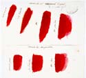
XXXI. L'ECARLATE rouge, communement apellée écarlate de Venise, sera teinte avec la graine de kermes, sans aucun meslange de bresil; sous les peines portées par l'articles XIX.
XXXII. L'ECARLATE ordinaire, ou couleur de feu, sera teinte de pure cochenille-mesteque, avec eau-forte, sel ammoniac, estain fin, amidon, sans aucun meslange de terramerita, ni de cochenille-sylvestre.
XXXIII. LES demi-écarlates ordinaires, ou couleur de feu, seront teintes conformement à l'article ci-dessus, en y adjoûtant la garence ou la cochenille-sylvestre.
XXXIV. LES demi-écarlates rouges, ou de Venise, seront teintes avec le kermès et la garence, sans aucun meslange de bresil.
LES demi-écarlates rouges, ou de Venise, seront teintes avec le kermès et la garence, sans aucun meslange de bresil.
Reglement pour la teinture des etoffes de Laine...du 15 Janvier 1737 (Paris, 1737), 10.
How should colors be named? Is there a way to establish specificity that transcends region and production processes? Can—and should—color names be rationalized through the combination of botany and chemical analysis? Through some other natural history or scientific order? Would establishing a naming system indicate conclusively the numbers of colors that exist? Can all colors be named? These are questions that arise from the problem of color nomenclature and that appear repeatedly in the archives of eighteenth-century color practices. No single answer to any of them emerged as best anywhere in the West during the eighteenth century. The same problems of naming colors exist now: It is possible that you will misunderstand me because, when I describe a color, you might see something quite different from what I do. This difference can depend on social as well as physiological factors. (Where some precision is needed I have tried here to supply additional descriptions or images.) But, like eighteenth-century chemistry and eighteenth-century production methods and eighteenth-century classification systems, the nomenclature problem is best accommodated by acknowledging the simultaneous criteria of naming strategies, and balancing the drift among them, accepting that one color may have several names and one name may mean several colors. Web Link Web Link
Key Words
Les Peintres appellent couleurs principales celles que les Physiciens nomment primitives, qui sont le blanc, le jaune, le bleu, le rouge et le noir: c'est avec ces cinq couleurs qu'on peut composer toutes les autres, en les rompant ensemble plus ou moins, selon les différentes nuances.
Antoine-Joseph Pernety, Dictionnaire portatif de peinture, (Paris, 1757), 478.
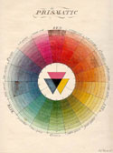
Eighteenth-century technical writing assumed differences between terms such as primary, simple, pure, primitive, basic, and matrix. Each had a specific meaning when used to modify the word color. A primary color was, generally, one of the six or seven colors found through the prism and in the rainbow. Leonardo da Vinci and, earlier, Aristotle had described simple colors as those made without mixing pigments—i.e., simple in their preparation. This definition suggested two further assumptions about color. The first, that there might be more simple colors than there were primaries, was invoked to resolve the difference between Newton's and painters' primaries. It explains why the two statements—that there are seven principal colors and that there are three colors that make all others—could coexist in painters' treatises and encyclopedic works without conflict. The second assumption is that it was possible, at least in theory, to have an intersection point for a simple and a compound color; that is, you could create a green color that matched the green found in the spectrum. These visually similar shades would not, however, create identical color ranges. The inherent differences were demonstrated through mixture with other colors, including black or white; the resulting shades would be different.
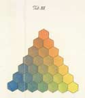
By the seventeenth century, painters recognized three colors that were both primary and simple—the pure colors red, yellow, and blue. Several eighteenth century writers suggested that, if there were three primary colors, then Newton's seven principal colors might be considered as the simple colors. This notion carried within it a hint that orange, green, and purple were less essential to the palette, rendering the suggestion not useful for practice. Furthermore, this delineation of simple and principal colors was complicated by the existence of different sources for certain simple colors. Which color was most simple? How many should be included? Richard Waller's chart includes more than twenty simple colors. reference John Harris Lexicon Technicum added only Indian ink to Waller's list, suggesting a level of agreement, at least among members of the Royal Society.10 reference The system could not be closed, however—or, rather, it would become apparent during the later seventeenth and eighteenth century that any list of simple colors would only expand with the introduction of new foreign imports and new chemical colors.
Les couleurs qui paroissent être dues naturellement à une substance simple, & qui ne peuvent être décomposées en deux ou en plusieurs couleurs de différentes espèces, ou être produites par le mêlange de deux ou de plusieurs substances, peuvent seules se nommer primitives, quoiqu'il puisse résulter différentes couleurs & différentes nuances de leurs combinaisons. Il y en a quatre de ce genre, savoir, le rouge, le jaune, le bleu & le noir. Quelques-uns ne regardent pas la dernière comme telle ; ils prétendent qu'elle n'est qu'une couleur bleue concentrée. Mais comme il ne résulte jamais une nuance bleue d'une couleur noire affoiblie, mais diverses nuances d'une couleur brune, on doit l'envisager comme une couleur primitive, aussi long-tems, que le contraire ne sera pas démontré; d'autres au contraire en admettent cinq, & y ajoutent le brun.
C. W. Pörner, "Des couleurs primitives" Instruction sur l'art de la teinture (Paris, 1791), 1–2.
If we now have some sense of the differences between a primary, principal, pure, and simple color, what, we might ask, is a basic color? Compare the common colors named in Newton's spectrum—his principal colors—with the common colors used in many practices. Even before the late-seventeenth-century organization of dye regulations in France, it was generally understood that the basic colors for dyeing were red, yellow blue, black, and a light brown color called fawn (in French, fauve). reference Basic colors for ceramics and enameling were often black, white, yellow, green, blue and purple—colors made from iron, lead, copper, zaffer, and manganese. The basic colors for painting depended more directly on subject matter and technique. Portrait painters used more flesh tones; landscape painters required a broader range of greens and browns. Painters en camaieu wanted only one color, often sepia or black. The set of colors basic to each style of painting was different. reference
6. Simple or Homogeneal Colours are such as are produced by Homogeneal Light or Rays, that have the same degree of Refrangibility; and mixt Colours are such as are produced by Rays of different Refrangiblity.
John Harris, "An Abstract of Mr. Newton's Doctrine . . ." in Lexicon Technicum (London, 1704), s.v. "Colour."
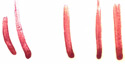
There was also a noticeable conceptual difference between Newton's colors and the basic colors in practical systems. reference Newton (and others) found a sequence of three visually close but differentiable colors (blue, indigo, and violet) near blue in his system of seven principal colors.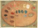 Colormakers often used seven principal colors too, locating a similar split among reds. Crimson reds inclined toward blue; scarlets were a concentration of yellow. Proof of this difference was plain. A good example of the latter was saffron, red-colored when dried and concentrated but a substance that creates yellow colors. Scarlets turned brown (like a dead leaf) with age and in certain fastness tests, as was characteristic of yellow colors. The attenuation of crimson did not produce blue as scarlet did yellow, but examples that seemed to indicate a relationship between these colors were purple of Cassius reference, various dyers' lichens, and the liquid that was the source of Tyrian purple. These substances, all of which could be used to make crimson colors, created a range of shades, from reddish purples to bluish violets. For colormaking practices, basic colors were some combination of scarlet, orange, brown, yellow, green, blue, crimson, violet, black and white. Rarely was it all eight.
Production realities tempered the concept of universal basic colors in other ways. Secondary colors made from a single coloring material were not always identical to those obtained by a combination of two primaries. Explanations of this phenomenon often related it to the understanding that, however similar the result, different processes produced different colors: This was proved when the attenuation or concentration of visually-similar colors yielded different results. The green of verdigris was not perfectly imitated by combining indigo with yellow berries, or Prussian blue with gamboge. Lichen violets were often paler shades than any combination of red and blue could provide. Diluted solutions did not necessarily yield a proportionately lighter color. Water or colorless oils were not analogous to light in this sense, nor was the addition of white paint to most pigments. reference
Recognized differences between colors of light and colors in objects meant that Newton's theory of color could not be extended to coloration at this fundamental point. The universal number of basic colors, the number advocated by many, was three, not the seven of the spectrum or even the five that were traditional to dyers. Red, yellow, and blue contain the possibility of all useful or all different colors. Black and fawn could be made from combinations just as green or orange are; they were basic colors although they were not principal colors.
^topThe Difficulties of Black and White
20
The White and Black cannot be ranked as colours; the first is only a composition of all the various colours combined together; the second is a privation of all colour.
Constant de Massoul, A Treatise on the Art of Painting (London, 1797), 122.
The definitions of black and white were another consistent problem to the formation of a unified terminology for eighteenth-century colors and colormaking. Even the briefest acquaintance with optics or the physiology of color introduced the ideas that black and white were the absence and presence, respectively, of all color, but not colors themselves. This remarkable idea was repeated in print and announced at lectures, and it suggested a number of other questions. If painting is an attempt to capture the reflection of light on surfaces, what is color on a decorated pot or a length of cloth? If black and white represent the absence and presence of all colors, what are the colors we call black and white? Why are there noticeable visual differences among degrees or shades of white and black? Web Link
Nous nous sommes bornés, dans le course de cet ouvrage à ne traiter que du mêlange des couleurs, sans avoir égard à leur lustre ou a leur obscurité. . . . Mais il sera facile à un chacun, en ajoutant quelque peu de couleur blanche, de produire tous les degrés de clarté, & en ajoutant quelques couches de chaque couleur, de les rendre aussi foncées qu'il lui plaira. Comme nous ne sommes point peintres de profession, nous ne nous engagerons point à définir exactement ce que signifiant les mots clarté, lustre, foncé, ombre, &c que plusieurs peintres emploient dans des significations différentes.
August Louis Pfannenschmidt, Essai sur la maniere de mélanger et composer toutes les couleurs (Lausanne; Paris, 1788), 138.
There were a number of arguments, among them several based on the authority of Aristotle, for consideration of black and white as colors. reference reference Both could be and were "made" for painting and glazing by using materials and processes similar to those yielding true colors. The traditional process to create lead white was nearly the same as that used to create verdigris from copper.11 Roasting techniques used to make certain blacks resembled methods to produce minium.
The limits these thought patterns suggest relate most clearly to painting and painting-based techniques in glass, ceramic, and enamel making. The creation and use of black and white for textiles was slightly different. White in particular occupied a different place in the dyer's palette, one with analogies both to grounding stages in painting practice and to the use of paper substrate to represent white. reference reference
Le BLANC est de toutes les couleurs de la peinture la plus importante : ce seroit peu de dire qu'elle sert à adoucir les nuances de toutes les autres, qu'elle leur communique ainsi les altérations qu'elle reçoit. Le blanc est sur la palette du peintre, comme la matière de la lumière qu'il distribue avec intelligence pour rapprocher les objets, pour leur donner du relief, & qui fait la magie de ses tableaux : à mesure que cette lumière s'affoiblit ou s'teint, les apparences changent, le prestige cesse, & la toile ne présente enfin que des plans chargés de couleurs ternes & sans expression.
"Peinture," in Encyclopédie méthodique - Arts et métiers mécaniques (Paris, 1789), 6:147.
Several sources and shades of white were available to painters, potters, and glass stainers, each with distinct visual and mechanical properties. Painters debated the relative merits of lead white, ceruse, zinc white, and white clay. Those who worked with vitreous colors could choose lead white or tin white as the base for a white covering glaze, depending on the circumstances of use, habit, and availability.
For textiles, whiteness was the basis for all colors, if not the basis of all colors. White or light-colored textiles were important on their own, but many coloring techniques required bleaching as an initial step, so that the natural tan-to-gray color of fibers did not intrude on the evenness or beauty of the finished color. reference Making textiles white was always a task for specialists whose work was distinct from that of the dyehouse proper. It is unclear whether the bleaching of textiles was understood as the removal of color (a perception that requires a concept of oxidation and reduction Web Link or similar mechanism), as a method of dyeing separated from others by practical traditions, or simply as an essential process within the set of those that comprise textile production.
25Demand for a good black—for inks, painting, printing, glazing, or textiles—was always high. Painters' blacks could be made from any number of charred substances; which one might be chosen depended on the qualities that were desirable given the circumstances of its employment. Lamp black was very oily. Bone black was often not dark enough. Ivory black, acclaimed as the best, was also the most expensive. One inventor suggested to the Society of Arts that the charred remains of fires—in grain warehouses, for example—would be an excellent source of black coloring materials. His recommendation was duly tested and approved, as was the advice of another, that old canvas (i.e., sails) could be burnt to provide the dry color needed to paint ships.12
 The creation of black cloth further undermined the idea of black as the absence of all color. reference In the dyehouse, it was often the combination of every color available. Some eighteenth-century recipes to create black for textiles call for successive dyeings in blue, red, and yellow baths.13 One rationale for the habit should be obvious; the choice of these three colors creates a link to the concept of trichromacy, but the economic implications of the recommendation are considerably more complicated. Three different dyebaths, each with its own preparation and finishing stages, might require the expertise of two or three different dyehouses. Black-colored cloth was both time-consuming and expensive to prepare this way. And, as Jacob Christoph Le Blon and Jacques-Fabien Gautier d'Agoty both admitted in the production of color-printed pictures, the result was not always the best black color possible.
The positioning of black among the colors in such a way that practice and theory could be reconciled created special problems for its classification and understanding. Some dyers suggested that the way black was obtained meant that it could not be considered a basic color. Others argued that, because it was made with the primaries, it must be a compound color.14 At the same time the need for a black color and, especially but not exclusively in the case of textiles, for black-colored objects was always high. Its location within the color palette, its position with respect to other colors, the connections between the need to create black and its description as the absence of color—all these complicated any reconciliation of the practices and theories of black, and any determination of its true nature.
Après avoir prouvé que le bleu, le jaune & le rouge sont proprement les seules couleurs primitives, & que, par une suite nécessaire de cette hypothese, il est possible de produire, du mêlange des ces couleurs, toutes les autres couleurs & nuances possibles, il nous reste à remplir la promesse que nous avons faite dans le titre de cet ouvrage, en indiquant comment l'on doit procéder pour une telle opération, & en quelle proportion ces couleurs doivent être mêlées ensemble. C'est ce que nous allons faire incessamment.
August Louis Pfannenschmidt, Essai sur la maniere de mélanger et composer toutes les couleurs (Lausanne, 1788), 29.
Philosophical painters and dyers who wrote about colormaking often circumvented the problems black and white created by reminding the reader that the rules of the terrestrial world were slightly different from those of the heavens. reference Spectral or prismatic colors were inherently different from the colors made from coloring materials. The separation of color into real and apparent, celestial and terrestrial, offered one explanation of the differences. Writers frequently outlined a scientific relationship between black, white, and colors but then retreated from drawing an explicit connection to coloring practice.15 Manuals of painters' practice, for example, might turn from statements about the refraction of light to a description of the proper combinations of colors needed to depict certain objects, or otherwise avoid a concrete statement whereby these two modes of considering color might be brought together. This strategy seemed to acknowledge that theory was significant to practice even if that significance could not be articulated clearly.
Practical realities underlying the ideal of trichromacy and the creation of black and white limited the use of practices in the explanation of theories. At the same time, the quest to establish the basic colors became more central as philosophical inquiries attempted to bring the study of color into alignment with details of practices and with the relationships demanded by the characteristics of coloring materials.
30In the eighteenth century, efforts to create unified fundamental definitions for colors drew on a variety of sources—contemporary philosophers, interpretations of the classics, traditional practice, observation and physical or chemical investigations—creating subtle variants that often do match modern terminologies. An impediment to our understanding of the competing definitions, and the occasional attempts at synthesis, arises with the meanings of some key words and concepts. Eighteenth-century acceptance that basic and primary were not synonyms did not disrupt the idea that some knowable system existed that could incorporate both. The ideal colors were as yet undiscovered. Until those paragons were found, other substances must be employed, perhaps not as good as the ideals but good enough for the moment. reference Recognizing this and resolving the issues of nomenclature are critical to understanding each colormaking processas a set of techniques that result in color. They are equally critical to our efforts to understand the joining of those techniques with theories.
^topNotes:
Note 1: Robert L. Feller and Ruth M. Johnson-Feller, "Vandyke Brown, Cassel Earth, Cologne Earth," in Artists' Pigments: A Handbook of Their History and Characteristics, vol. 3, ed. Elisabeth West FitzHugh (Washington, D.C., 1997): 157–90; Ralph Mayer, The Artist's Handbook of Materials and Techniques, rev. ed. (New York, 1957), 47, 50; R. D. Harley, Artists' Pigments c. 1600–1835: A Study in Documentary Sources, 2d ed. (London, 1982), 149–50. back
Note 2: Helmut Schweppe, Handbuch der Naturfarbstoffe: Vorkommen, Verwendung, Nachweis (Landsberg / Lech, Germany, 1992), 421, 279–80; Mayer, The Artist's Handbook, 53, 47; Helmut Schweppe and Heinz Roosen-Runge, "Carmine-Cochineal, Carmine and Kermes Carmine," in Artists' Pigments: A Handbook of Their History and Characteristics, vol. 1 ed. Robert Feller (Washington, D.C., 1986): 255–83. back
Note 3: Cuthbert Gordon to the Chemistry Committee, 22 May 1761, [R]SA PR.GE/110/11/20. back
Note 4: Fairchild's Dictionary of Textiles, ed. Isabel B. Wingate, 6th ed. (New York, 1967), s.v. "Nankeen." back
Note 5: On this topic in the history of science, see Alan E. Shapiro, "Artists Colors and Newton's Colors," Isis 85 (1994): 600–30; and in the history of art see, for example, John Gage "Colour in History: Relative and Absolute" Art History 1 (1978): 104–30, and John Gage, Color and Culture: Practice and Meaning from Antiquity to Abstraction (Boston, Mass., 1993), 155–68. Rolf Kuehni addresses the same problem in Color Space and Its Divisions: Color Order from Antiquity to the Present (Hoboken, N.J., 2003), see esp. 15–16, 123–55. back
Note 6: Gage, Color and Culture, 11–16; Kuehni, Color Space and Its Divisions, 19–103. back
Note 7: For typical eighteenth-century comments about the colors used by "the ancients," see Mauclerc's prefatory letter to his Traité des couleurs et de vernis (Paris, 1773); "The Origin of Painting," Monthly Review 15 (1754): 112; Thomas Cooper, "Observations on the Art of Painting Among the Ancients," Memoirs of the Literary and Philosophical Society of Manchester 3 (1790): 545–97; Rudolf Erich Raspe, A Critical Essay on Oil-Painting Proving That the Art of Painting in Oil Was Known Before the Pretended Discovery of John and Hubert Van Eyck. . . (London, 1781). back
Note 8: Dominique Cardon, "Textile Research: An Unsuspected Mine of Information on Some Eighteenth-Century European Textile Products and Colour Fashions," Textile History 29 (1998): 93–102; Ian Bristow, Interior House-Painting: Colours and Technology, 1615–1840 (New Haven, 1996); John Mills and Raymond White, "Analyses of Paint Media," National Gallery Technical Bulletin 9 (1985): 70–72. back
Note 9: Viquesnel, "Mémoire," 24 April 1765, AdS pochette; "Rapport de Tillet et Macquer sur le carmin du sieur Viquesnel," 15 May 1765, AdS pochette; on Newman's yellow see the account book, dated from 2 April 1787, Berger Jensen and Nicholson Archives Hackney Archives D/B/BER 1/2/3. See also Harley, Artists' Pigments, 113. back
Note 10: John Harris, Lexicon Technicum: Or, an Universal English Dictionary of Arts and Sciences: Explaining Not Only the Terms of Art, but the Arts Themselves . . . (London, 1704) s.v. "A Catalogue of the Simple Colours." back
Note 11: Ernst Homburg and Johan H. De Vlieger, "A Victory of Practice over Science: The Unsuccessful Modernisation of the Dutch White Lead Industry 1780–1865," History and Technology 13 (1996): 33–52; Reed Benhamou, "The Verdigris Industry in Eighteenth-century Languedoc: Woman's Work, Woman's Art," French Historical Studies 16, no. 3 (1990): 560–75. back
Note 12: "Converting Articles Burnt by Accidental Fires into Useful Substances," Committee Minutes of the Chemistry Committee," 16 April 1803 and 14 January 1804, [R]SA Minutes of Various Premium Committees 1802–1803 and 1803–1804 [R]SA PR.GE/112/12/44; and "Burning Old Canvas for Dry Color" 30 March 1807, Committee Minutes of the Chemistry Committee, [R]SA Minutes of Various Premium Committees 1806–1807 [R]SA PR.GE/112/12/47. back
Note 13: Le Page, "Mémoire," 17 March 1779, AN F/12/1330; Malachy Postlethwayt, Universal Dictionary of Trade and Commerce (London, 1751–1755), s.v. "Dyeing"; A Society of Gentlemen, A New And Complete Dictionary of Arts and Sciences: Comprehending all the Branches of Useful Knowledge, with Accurate Descriptions as well of the Various Machines, Instruments, Tools, Figures, and Schemes Necessary for Illustrating Them . . . (London, 1763–64) s.v. "Dyeing." back
Note 14: J. C. Michel, "Des Couleurs Primitives" Mémoire sur la teinture en general, et en particulier . . . [October 1810], AN F/12/2260; Jacques Neilson, letter accompanying [Quemiset] "Cours Général pour la Teinture en Laines," [22 May 1775], AN O/1/ 2047.back
Note 15: Encyclopédie méthodique - Arts et métiers méchaniques (Paris, 1782), s.v. "Couleurs;" Constant de Massoul, A Treatise on the Art of Painting, and the Composition of Colour, Containing Instructions for All the Various Processes of Painting; Together with Observations upon the Qualities and Ingredients of Colours, Translated from the French of M. Constant de Massoul (London, 1797); Mayol, Introduction à la Mignature (Amsterdam, 1771). back