Number, Order, Form
Color Systems and Systematization
1Assume that it is possible to determine the number of colors in the world. Ignore, for the moment, certain philosophical and physiological questions—for example, whether a color exists if it cannot be seen and if the number of colors must be different for each person because it is a unique product of the physics and biology of the eye. While these considerations are important in themselves, they are, for our purposes, tangential. If we can agree that the number of colors is finite and determinable, then what is that number, and how is it calculated? How do the answers to these questions aid the work of colorists, whether scientists, manufacturers, experimenters, or the unaffiliated curious?
Assume also that there is some primordial physical form for colors, one that conveys critical information to the viewer at a glance. What should this be? What should it tell? How should it be created? How, exactly, will this critical information aid and reflect the development of the practices and theories of color?
Finally, accept that the relationship among coloring materials is such that specific mixtures of certain colors yield specific other colors. There must be, then, some small number of colors from which all others are made. What is that number, and what are those colors?
I have begun upon a great undertaking. The arrangement of my fossils and making a catalogue for them. As a Potter I make clays my first article, after which stones vitrifiable will follow, but I cannot draw the line betwixt clays and some of the stones. It [sic] steatites for instance I have specimens of every degree of induration from the hardness of soap to the most compact polished jasper and they illustrate the fact of jaspers being indurated steatites, so clearly and fully that I cannot find in my heart to keep them asunder. Our sagar clay shale and the coal mine stone are in the same way and some
Josiah Wedgwood to Thomas Bentley, dated Etruria, 1 November 1779, Wedgwood MS, E18935-26.
Eighteenth-century investigators for whom these questions were ongoing considerations had access to a variety of authorities for guidance.1 Descriptions and devices—attributed to Aristotle, Roger Bacon, Leonardo da Vinci, Descartes, Kircher, Newton, and others—suggested answers, but all seemed inconclusive. reference Artisans and scientists who considered the problems of color often assumed that complete answers would derive from the appropriate combination of natural history, natural philosophy and the arts. Together they would create a single color system, one that would explain the nature of color and confirm the number of colors in the world. The understanding of color as an inherently scientific subject would thereby be augmented. The connection between celestial and terrestrial color—color of physicists and color for artisans—would be established.
Once located, this universal organization for color would be a reference tool with many applications. Its tangible form, a visual classification system, could improve the accuracy of information transmitted among people, regions, or countries. It might solve the problems of color nomenclature and simplify future studies of the practical and scientific aspects of color. reference If there is a finite number of primary or principal colors, there should be a mathematical limit to the number of colors they combine to form. The organization of color might determine those numbers. This knowledge could further the project of delineating relationships among colors and those between sciences and art more generally.
Locating and describing the natural order of color would also have a clear significance for eighteenth-century color-based manufactures. Knowledge of the number of basic colors would suggest how best to create others. The economic benefits of a limited palette demonstrated in colormaking practices—notably textile dyeing and printing, and enamel painting—would thus be extended further.
La doctrine des couleurs, & celle de la lumiere qui en est inséparable, fait une partie importante de la Physique, & des Mathématiques appliquées; elle entre essentiellement dans la connoissance des sensations, dont les couleurs sont non seulement la branche la plus considérable, mais aussi la plus susceptible d'analyse, & la plus propre par consequent à nous laisser entrevoir ce qui se passe en nous quand nous croïons appercevoir les êtres hors de nous. Il semble donc qu'on ne sauroit trop approfondir un objet qui tient si intimément à toutes les classes des sciences, & auquel un grand nombre d'arts sont encore si particulierement intéressés.
Nikolaus von Beguelin, "Remarques et Observations sur les Couleurs Prismatiques et sur l'Analyse Physique, et Métaphysique, de la Sensation des Couleurs en Général," Histoire de l'Académie royale des Sciences et des Belles-Lettres de Berlin 1764 (Berlin, 1766), 306.
Creating an image that embodied these goals was not simply a question of finding the right mathematical, physical, or chemical formulas, however. Practical details interfered. Identification of the basic colors differed among occupations, and every manufacturer had its own standard palettes. Assumptions about the origins and derivations of color had an effect on the display system preferred by each discipline. Any color classification system therefore reflects artisan groups its inventor consulted. Choices of coloring materials also affected the creation of color displays: An investigator might identify the basic colors only to find they did not combine well, or could not combine at all.
Throughout the eighteenth century, people with different underlying interests in color contributed to the search for a comprehensive, visually-based order system for color and, to that end, created a physical demonstration of the alliance between science and art. The authors of systems founded on scientific ideas took pains to highlight their value to artisan communities. Artisan designers who attempted to develop a universal color system were equally careful to prove that they had consulted scientists. The results exhibit the flexible accommodation for novelty that was an integral part of eighteenth-century standards. reference In this section, I will look at some attempts by scientists to create color classification systems. I will consider the physical layout of those systems, the theories underlying them, the practical scientific value of the systems, and how those systems met the general goal of contributing to science. I will indicate how they typified the social or cultural ideals of enlightened participation; ideals based on assumptions that this use of science to give color a simple order would benefit artisans as much as it would science itself.2
I caution that this is not a section about eighteenth-century confrontations between real and apparent, or additive versus subtractive colors. Many eighteenth-century colorists—the practitioners and the philosophers—who wished to identify the order of all colors recognized the problems presented by these differences. The discovery of an order that would explain both the color of light and the color of objects was an underlying goal, but any tangible visual system relies on material substances—whether pigments, metallic oxides, or dyestuffs—if it is to be exchanged or transmitted as a useful thing. The differences between the two types of color appear constantly. Attempts to resolve the differences exerted great influence on results, but philosophical debates about them do not. reference Web Link Web Link
10Finally, even though vestiges of several of the systems I describe are familiar to color science and to art students today, it will be useful to remember that no eighteenth-century system was inherently better than any other. The construction of these tools, like calculations for every unifying system, fell apart under the realities of applying both practice to theory and theory to existing practices. Eighteenth-century attempts to describe and classify color offer an opportunity to understand what technical expertise in color and colormaking meant to physicists and chemists and to understand how they used artisan practices to explain their own work.
^topNumber, Shape, and Form
A successful color ordering system requires an appropriate shape, the correct number of colors to include, and the proper medium in which to present its information. One way to create order for color was to devise an arrangement based on existing objects. This form of categorization, common before as well as throughout and after the eighteenth century, was a simple and accessible opportunity to apply practices to theories. Graded scales could be created from collections of natural materials—ochers and other colored earths, for example, or rocks, or shells—that were believed to have stable and consistent colors. Yet, however satisfying it was to make such scales, the result was insufficient. Few single natural sources included all recognized colors, and it was often difficult to create a comprehensive order from the available samples.
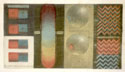 What is the simplest design that can communicate a relationship among colors? It might be no more than a bar or line, perhaps based on the shape that appears when light is passed through a prism. Bars of colors convey two basic ideas: Color exists and it has a regular order. A linear form hints at a progression that can be linked to wavelengths or cycles, but it does not accomplish much more. It does not suggest complexities of color relationships and so does not validate other aspects of either practices or ideas. The shape and the placement of color may not be arbitrary, but the value of the system is limited.
Color Tables or Color Graphs
Color tables expand the color bar, literally and figuratively. They offer a similarly recognizable display of information, but one that suggests interior relationships through size, shape, or placement of the colored areas. As a means to order information, a table of colors, like a modern graph, permits critical information to be read at a glance, enabling the reader to verify the accuracy of the experimental method (here, the layout or progression of colors) and its conclusions.3 The components of Cartesian coordinate systems were familiar tools in eighteenth-century sciences and mathematics, but graphed information appeared only rarely in contemporary scientific journals. Their meaning was slightly different: Graphs did not provide incontestable evidence as they do now, they confirmed ideas expressed elsewhere in words or pictures. Nevertheless, any mathematical graph with two (or more) axes does emphasize relationships among the data it presents. As this was a goal of visual classification systems, it is valid to draw connections between graphs and color classification forms. Eighteenth-century uses of graphing systems to imply color relationships present a direct connection between practical knowledge and mathematical ideas in efforts to classify color or colored objects.
Richard Waller's Basic Chart
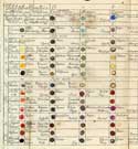 One graph-based system for which the author claimed usefulness for artisans was presented, in 1686, at the Royal Society of London.4 Noting the lack of a standard for colors in natural philosophy, and inspired by a similar table published in Stockholm, Richard Waller indicated that his "Table of Physiological Colors Both Mixt and Simple" would permit unambiguous descriptions of the colors of natural bodies. To describe a plant, for example, one could compare it to the chart and use the names found there to identify the colors of the bark, wood, leaves, etc. Similar applications of the information collected in the chart might also extend to the arts and trades, he suggested.
Waller offered the Society and, through its publication, readers, a grid containing 119 colors. He arranged his choices in a progression from lighter to darker colors but did not claim to include all variations of all mixtures. From left to right at top, there are seven colors, all pure reference (i.e., unmixed), ranging from Spanish white through deeper blue colors—smalt and indigo—to atramentum siricum, a dark blue-black. At left, from top to bottom, are first the pure yellows and then the pure reds, moving from lightest (ceruse) through atramentum fuliginosti, a dark red-brown. Mixed colors fill the balance of the grid; lighter shades are clustered in the top left and in the lower right are the darkest blacks. Waller's text suggests the mixed colors represent equal mixtures of the pure color samples at the top and left edges of the graph. He explains how to create these interior colors, but the names suggest that they may have been purchased, or that it was possible to do so.
Waller's color chart is a simple visual system that incorporates both practical and theoretical considerations. This duality is reflected in an organization that suggests a progression from light to dark and classifies color within color groups. The graph form implies that a combination of cinnabar and mountain blue will produce a carnation color, while gamboge and mountain blue will create popinjay green. The reds called fire, brick, and earth are all related to minium, if not actually made from it. Colors grouped under smalt include hyacinth, sea green, leek color, ingrain purple, paonaceus, and iron gray. In addition, the layout Waller chose incorporated two philosophical notions about the origins of color. The first, an idea often associated with his colleague Robert Hooke, was that all colors are derived from red and blue. Yellow is an attenuated red, as saffron, safflower, and other natural sources proved. reference reference Waller's chart acknowledged some of the difficulties created by this assumption, the most obvious ones being that mixtures of red and blue and of yellow and blue give very different colors, but he does not attempt an explanation. The second theoretical position indicated by Waller's chart was that colors are made from the combination of lightness and darkness, often analogized to white and black. This concept was attributed to Aristotle, a part of his philosophy of colors that was retained and retested by natural philosophers with greater tolerance during the eighteenth century than was the four-color theory also credited to him.
I chose Weight rather than Measure because the heavier Colours have generally the more Body and therefore come nearest to an Equality that way.
Richard Waller, "A Catalogue of Simple and Mixt Colours,. . ." Philosophical Transactions 16 (1688): 25.
Waller's visual system exhibits the same conceptual problem with respect to its organization and enumeration that plagued nearly all eighteenth-century classification systems. Which colors can be included and what is their "correct" order? The answer was always tempered by available coloring materials and choice of media. reference reference The success of a visual system, as Waller noted in the text accompanying his graph, is dependent on the pigment-plus-medium combinations that combine evenly and equally. The mixture of equal quantities of blue and yellow must make a green that is neither bluish nor yellowish. Waller chose weight as the controlling factor for his mixtures, noting that it was easier to achieve the visual equality he desired with heavier colors. He did not describe how he equalized or made the colors comparable, but it may have been by adding white lead or ceruse to the pigment-oil mixture. His choice of this medium may be the reason some of his color choices are now unreadable.
Information-laden, and suggesting a matrix of relationships, graphs or grid systems such as this one were more valuable as a general classification than as a catalog colors. Waller's table, while more expressive than a color line, was no more than a basic arrangement of colors. It never became a standard as he had hoped.
Jacob Christian Schäffer's Natural History Hierarchies
Es ist auch wohl in dieser Sache nicht eher etwas Bestimmeres zu hoffen, als bis man Mittel wird ausfindig gemacht haben, wie die Farben sinnlich voneinander unterschieden werden können, und welche von den Farben eben so und so heißen soll. Mir ist ein Gedanke, wie dieses möglich zu machen seyn mögte, vor einiger Zeit beygegangen. Ich habe auch schon den Versuch diesfalls gemacht, und es scheinet mir allerdings thunlich. Welch ein Vortheil würde den Naturforschern dadurch zuwachsen, und solches der ganzen Naturwissenschaft zur Förderung dienen! Ich bin gesonnen, einem gewissen Tagbuche diese meine Gedanken mit nächstem einverleiben zu lassen. Finden solche Gedanken Beyfall, so werde ich mich in einer eigenen Abbandlung näher erklären und einige Proben liefern, worauf alsdenn seiner Zeit das Werk selbst folgen könnte.
Jacob Christian Schäffer, Fernere Zweifel und Schwürigeiten in der Insectenlehre ...(Regensburg, 1766) 17–18. Quoted in Schäffer, "Vorrede," Entwurf einer allgemeinen Farbenverein (Regensburg, 1769), n.p.
Like Waller, Jacob Christian Schäffer was concerned with standardization of transmitted information about color. He devised a different form for his table system, an expanded one with a correspondingly increased practical value. Schäffer designed his method to ensure that illustrations in his own books could be colored properly by anyone anywhere. As the author of volumes on the classification of insects, mushrooms, and fish, he knew, through personal experience, of the problems of color and coloring. One particular concern was color names. Schäffer remarked that identification would never be definitive until there was a way to distinguish colors and so to know when one should call this color this or that color that: The advantages of such a system to nature studies would be tremendous.5 Because what worked in one discipline would also work in others, Schäffer further believed his color classification system would be useful for the illustration of other publications, and in other arts and trades.
Schäffer outlined his order for color in nine rules. The first few state general concepts. There are seven simple and natural principal colors (red, yellow, blue, green, brown, white, and black), and colors may be made from a mixture of two, three, or more of the principal colors. reference The remaining rules, based on Schäffer's own research, describe the construction of his classification aid and explain its system.
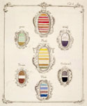 Schäffer's system relied on colors that could be found in an artist's shop, and it called for many mixtures, including combinations within a color group: reds with reds, browns with browns, etc. Rather than attempt to include all colors in a single sheet, he devised an initial page of principal colors, and separate pages for colors made from mixtures. Schäffer's conception of color is genealogical and hierarchical; he presented the principal colors not as a continuous line but as families, each with its own coat of arms. Schäffer identified uneven numbers of pure colors for each principal; his system includes twenty-seven pure colors. This suggests a very large number of colors in the world—the factorial of 27 (27! or 27 x 26 x 25 . . . x 1). Each shield contains bars of unmixed colors, and each principal color is further expanded on a subsequent page that displays both unmixed and mixed colors. The most important colors—red, yellow, and blue—are presented in shields that are physically larger than the other five are. The shields offer visual information about the range of colors available and Schäffer's opinions about what constitutes a principal color.
Kugellack
Eine so bekannte Farbe der Kugellack ist, so unbekannt ist seine Bereitung. … Hr. Wiegleb vermuthet daher, daß der vorzüglichste Bestandtheil des Kugellacks vegetablischer Art seyn müsse, glaubt das Geheminiß ergründet und sich durch verschiedene versuche in den stand gesetzt zu haben, folgende richtige Beschreibung des venetischen Kugellacks geben zu können.
Carl Friedrich August Hochheimer, Chemische Farben-Lehre (Leipzig, 1792), 97–8.
Schäffer used the red group to explain how to prepare color-notation charts that would provide more-detailed classification and, ultimately, enhance the practical purposes of the system.6 The charts required a paper divided into 150 small compartments, each numbered for identification. In his sample, boxes 1–8 repeat the principal colors of the general table, the unmixed or unbroken reds: minium, cochineal, cinnabar, carmine, Kugellack, brazil red, Florentine lake, and English red. reference The balance of the page was to be filled with red colors made by mixing the principal reds with each other and with other colors.
Schäffer's model contains an additional internal order, one based on the three realms of natural history. His designations of animal, vegetable, and mineral colors do not relate to the source of the mixed color however, but to the realm of the specimen on which the color is found. reference Schäffer reserved boxes numbered 37 through 43 for colors found on animals, and the accompanying text explains how to make them.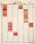 Continuing in the same fashion, he then describes the mineral colors and then three color samples that replicate reds from the vegetable kingdom (Judenkirschroth, Paedonienroth, and rose red). Other compartments are set aside for "arbitrary" mixed colors, which are the result of combining two or three principal colors and do not derive from a single kingdom. The last group of compartments contains red insect colors. Again, these are not colors made from insects such as cochineal or kermes, but rather special colors that Schäffer had employed in the illustrations for his entomological treatise.7
As an effort to simplify color, Schäffer's classification system is most remarkable for its complexity. The system is closely tied to Schaffer's own experience, especially his frustrations at communicating information about color. As a result, the tables contain some unusual features. Rather than locating color samples and matching natural-history specimens to them, Schäffer fills his tables with the colors recreated from those of known flora and fauna. The position of the mixed colors in the single-color chart is based on the realm of origin for that color rather than visual similarities or composition. Red-color number 40 (red of a woodpecker's head) is made of carmine, cinnabar, and brazil lake, while number 41, the red of a woodpecker's breast, is a combination of minium, cochineal, and lead white. Clearly, Schäffer believed that colors within a species are consistent throughout it and that names for colors are constant through all regions. Yet this reliance on local examples, combined with normal differences in color production techniques, would make guarantees of accurate and widespread replication nearly impossible. reference There was no way to ensure that Schäffer-style color systems created in different places would match each other to a degree that two people could compare objects with certainty. If a goal of the work was standardization via classification, it could be met only by those familiar with Schäffer's other work, or those who had learned their colormaking skills at the same place as he or his illustrators had.
^topAbraham Gottlob Werner's Geological Classifications
25
Die Farbe ist unter denen generischen Kennzeichen das erste, so uns an den Foßilien in die Sinne fällt.
Abraham Gottlob Werner, Von den äußerlichen Kennzeichen der Foßilien (Leipzig, 1774), 87 §41.
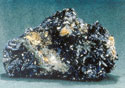
Schäffer hoped his color system would gain value as a general standard and a tool for artists and illuminators specializing in natural history.8 There is evidence that it was used by at least a few artists or artisans, and similar arrangements were incorporated into identification aids based on other natural-history collections. Abraham Gottlob Werner, the geologist and Bergmeister at the mining school in Freiberg (Saxony), used Schäffer's treatise as a starting point for his own specimen-based color-identification system.9 Werner's color system had a more limited objective than Schäffer's but a broader range; it was part of an effort to describe and classify all characteristics of "fossils"—rocks and minerals dug out of the earth. Werner's system was known to natural philosophers other than geologists and, despite some recognized drawbacks, was considered a viable rubric for color organization into the nineteenth century.10
In Werner's classification system, again an expanded table format, certain fossils demonstrate the color characteristics of all other fossils. His choice of these identifying materials was directly connected to his work and expertise, and it evoked traditional uses of natural-history specimens to create order for other disciplines. Yet the use of mineralogical examples as the backbone of Werner's classification system is inherently problematic as the entities he hopes to define provide the descriptive terms. This duality is a manifestation of assumptions about the relationship between objects and ideas, much as Schäffer's color charts were, and they are limiting in similar ways. reference
Systematisch ist eine Benennung, wenn sie nicht allein die Sache von andern Gattungen unterscheidet, sondern auch zugleich das Geschlecht, zu welchem die Sache gehöret, mit ausdrückt, und also der Geschlechtsname mit dem Namen der Gattung verbunden ist, als z.B. blaulichschwarz, scharlachroth, himmelblau.
Abraham Gottlob Werner, Von den äußerlichen Kennzeichen der Foßilien (Leipzig, 1774), 92–3 §44.
Werner arranged his samples according to a modified Linnean order. Principal colors are the genera of his classification system and there are eight: white, gray, black, blue, green, yellow, red, and brown. The shades or tones of each color differentiate species, as do the stripes on Schäffer's color shields. Werner lists fifty-four species of color: seven whites, six grays, four blacks, six blues, six greens, nine yellows, ten reds, and six browns. Specific colors are named by the addition of a modifying word to the generic term. The modifiers refer to familiar or common objects (sky-blue, milk-white), to familiar metals (silver-white, gold-yellow) or to coloring materials (indigo-blue, verdigris-green). The names of a third species suggested a subtlety achieved in the mixture of colors (bluish gray, yellowish brown) but there are no fossil equivalents to colors made from the mixture of two or three colors.
Werner noted but did not include a fourth species of color, one also mentioned by Schäffer: colors with fanciful names such as the pompadour colors appear only rarely, he claimed. reference Nor does he isolate colors named for the place in which they are most famously made (Prussian blue, Naples yellow, Venetian scarlet), although they appear in his chart. These colors, he suggests, have other, less transitory names. While the evasions relieve Werner's visual system of some significant descriptive problems, they also separate his system from important and common color designations and so limit its non-technical or non-scientific role.
Accurate color descriptions must reflect the relationships between shades of similar colors. Werner further divided each species into dark, clear, light, or pale colors, resulting in a total of 216 colors. Some twenty-five years later, the English translator of Werner's treatise almost doubled the number of color specimens, giving a basis of 86 colors and so a probable total of 344.11 Werner himself had noted that the true number needed to describe geological specimens is actually twice the number of specimens. Certain items will have a color that falls on a mean between two others. Compact malachite, for example, is a color between verdigris-green and grass-green. Magnetic pyrites are darker than bell-metal-yellow but not as deep as copper-red. This neither-nor color-location method works adequately to identify colors of samples but less well in the transmission of information about those objects when they are not present. It is simply too vague.
30Finally, Werner created a species category for "tarnished colors." When certain fossils are cracked open, he explained, they show a different color on the surface from that of the interior.12 This discrepancy is caused by the encrustation of one mineral substance over another—for example, when copper pyrites are covered with iron ore. The colors result from a change in the chemical constitution of the surface of the rock (such as loss of phlogiston reference caused either by combination with another substance, or by losing one of its constituent parts. Tarnished colors are analogous to colors that fade or darken over time. Werner's effort to acknowledge this behavior in his classification system seems to be unique. In other systems, color change in the sample is a worrisome production problem but not a characteristic critical to identification. reference
Both Werner and Schäffer created color catalogues based on perceived need derived from personal scientific study, a typical rationale for undertaking such an endeavor. Their charts and tables were aids to describe or differentiate natural objects; both systems offered direct comparison of colors and a minimally standardized nomenclature. Each man redefined the notion of all the colors in the world to mean all the colors of natural history, or a certain portion of it and they reached wildly disparate conclusions about that number—about five hundred according to Werner, and more than 4000 for Schäffer. Projections of the broader value of these two systems were based on assumptions about the commutative possibilities of information and information systems: If nature is uniform, if nature is simple, then a good system created to serve one discipline will serve others as well.
^topSeparating Color from Colored Objects (Other Graphic Systems)
Tobias Mayer's Trichromatic Graph
 Charts and tables were useful tools for natural philosophers; as classification devices their forms were reinvented and refined throughout the eighteenth century. The three-sided color graph developed by the astronomer and mapmaker Tobias Mayer, for example, drew several themes in mathematics and optics into a descriptive aid for color. Mayer first presented his ideas about a color system at a lecture in Göttingen in 1758.13 Several German periodicals described the content of the lecture in detail and its information spread quickly, as those articles were republished. Mayer's triangle became, after Newton's color circle, perhaps the most recognizable color classification form in the eighteenth-century West. reference Painters (and amateurs of painting) adopted and adapted Mayer's conceptualization of a color triangle to regularize their own practices. reference Natural historians used it to identify objects and to situate relationships between the sciences and the arts. When examined together, Mayer's triangle and its later variations offer an excellent example of the eighteenth-century effort to create a unified, mathematized description of colors and to extend the value of this description into artisan worlds. As an episode within the centuries-long effort to systematize color as a way to understand and control it, the development of Mayer's color triangle highlights the constraints produced by materials, the limits of mathematized descriptions, and the relationship of those limitations to representation and understanding of color.
 Mayer based his triangle on clearly stated precepts that addressed some recognized problems of color display systems. First was the definition of pure and simple colors. In eighteenth-century scientific descriptions, these were often linked to the prismatic spectrum. Seven simple colors, usually the seven Newton identified, were often cited. Pure colors were those made from a single coloring source and not the combination of any others: Orange was a simple color and certain coloring materials provided orange shades, but because the combination of red and yellow pigments could yield orange, it was not a pure color.
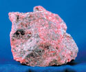 Following contemporary painters' practices, Mayer showed that only red, yellow, and blue met his criterion for pure and simple colors. His choices for the best sources for these pure colors, for the liveliest and most beautiful red, blue, and yellow were, respectively, cinnabar, mountain blue (azurite), and gamboge.
Mayer's system also demonstrated the common assumption that, combined in the correct proportions, this small number of basic colors could create all others. This was a more intuitive idea, artisan-based and not always evident in other visual classification systems. Waller's grid incorporated graded colors in a way that suggested that colors were made from varying combinations of darkness and lightness. Schäffer's and Werner's systems relied on the alternative concept of principal colors. Principal colors might be pure in the sense that they were unmixed mechanically, but not all were: For those two systems, principal subsumed the definition of pure. reference
35If there are three basic colors, then the triangle becomes an obvious choice to display them succinctly. A different pure color is placed at each angle or corner of the triangle, and the balance may be filled with their mixtures. Appropriately sized, the triangular form could contain all combinations within one system.
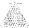
Mayer's Color Triangle
 Mayer also conducted a study to guide the size of the triangle. His tests of visual perception determined that the eye can distinguish only about twelve gradations between any two colors.14 Accordingly, his triangle has thirteen compartments on each side. At each extreme, the angular color is a perfect or pure color. Each is separated from the two other pure colors by eleven proportional mixtures of them.
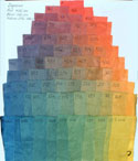 The two chambers on either side of the angular blue (designated b12 in Mayer's notation system) would have, respectively, eleven parts blue to one part red and eleven parts blue to one part yellow, and so on. The fifty-two compartments at the interior of the triangle are filled with mixtures of the three colors, each combination calculated according to its position within the triangle. The center block would have equal parts each of red, yellow, and blue (r4y4b4); the compartments surrounding it would have combinations of three, four and five parts of each color, depending on location. Web Link
Mayer's complete color system included other triangles made up of the pure pigments mixed with progressively larger quantities of white or black. These triangles had progressively fewer compartments as the colors approached white (lightness) or black (darkness). The first set of pale and dark triangles each had twelve compartments per side rather than the thirteen of the main form. In each, the angular colors were eleven parts pure color to one part black or white. The second set of triangles had eleven compartments per side; the angular colors were ten parts pure color to two parts black or white. Calculated from perfect colors to full white and full black, the total number of colors in each category, pale and dark, was 364. Added to 91, the number of colors of the main triangle, the total number of perfect and dark and pale colors was 819. That, by Mayer's definition, was the number of colors in the world, although his color algebra indicated that more colors might exist.
Mayer described how these triangles determined and defined colors. reference His graphs were bi-directional, equally useful to describe a color at hand or to determine the formula to make any color the eye could see. One could compare a color found on an object to the colors in the triangle and, because location on the graph was determined by the proportions of the preparation, know its composition. Alternatively, one could choose a color from the schematic and know immediately the combination of red, yellow, blue, black, and white needed to recreate it.
Still, as Georg Christoph Lichtenberg found, to construct Mayer's triangle was no simple task.15 reference Lichtenberg noted, for example, that the most effective way to make the pale colors of the supplemental triangles was a simple dilution of the pure colors, allowing the paper support to transmit the required proportion of white. reference The complement, concentrating pure colors, was less successful for the creation of the dark triangles however, and the addition of a black tincture made of an equal combination of red yellow and blue pigments was never dark enough. reference Furthermore, Lichtenberg admitted, it was difficult to obtain all colors from mixtures of only two or three. Even Mayer did not use his angular pigments to mix pinks and violets but instead based them on pure colors available to him.
40Whether Mayer ever constructed a complete triangle or a set of complete triangles is unclear. Lichtenberg's effort and discussion of his own version of Mayer's triangle further demonstrate assumptions about the nature of art and the problems of its use to express scientific ideas. Lichtenberg's published version of Mayer's triangle truncated the form to seven chambers per side because of some practical problems. Using Mayer's methodology of proportional mixtures, for example, resulted in midpoint colors that were dirty-looking, not the clear greens and violets of the imagination. Lichtenberg attributed this to different physical properties of each pigment including differences in their ability to absorb water, the medium. As Waller had used weights, Lichtenberg used specific gravities to compare colors, and he reconfigured his pigment choices so that the initial ratios of yellow to blue was one to six; of blue to red was two to one, and of yellow to red one to three. He also employed different pure pigments from those recommended by Mayer, choosing amber, Prussian blue, and natural cinnabar as the angular pigments.
Mayer's color system was graph-like and number-based. It seemed to achieve the scientific goals common to classification projects: overall simplification, recognition of order, and a clear articulation of the advantages that those two qualities might offer practices via the use of theories. Visually elegant, Lichtenberg's recalculation of Mayer's triangle, like Mayer's triangle itself, was nevertheless a difficult tool to create and to use. One problem related to the angular colors, as Lichtenberg encountered. Although Mayer's description called for cinnabar as his pure red, the color used in his sample formulas is the more yellow-toned red lead (Mayer's formula for red lead is r8y4. Although azurite is Mayer's pure blue pigment (b12), his examples of color mixing and identification relied on Prussian blue (b11r1). reference Mayer did not explain these discrepancies, and there may be several reasons for them. Cost and availability may have restricted access to the materials that Mayer initially chose. If minium and Prussian blue were less expensive and less difficult to obtain outside of large cities, it would be more practical, as well as more practice-based, to use them. It is also possible that the change from Mayer's pure colors to other, imperfect or mixed colors resulted from the properties of Mayer's choices. Neither vermilion nor gamboge is reliably permanent.16 The practical value of the triangles would be limited if the materials used to construct it were incompatible or otherwise unstable. reference Finally, although it is unlikely that this was deliberate, Mayer's use of nonperfect colors in mixtures has the effect of emphasizing his point that nearly any coloring material could be adapted to his techniques of color composition and identification. reference
Mayer's color classification system illustrates the difficulties of adapting art practices to the sciences. In the imagination or as a hypothesis, the combination was almost effortless. Mixing pigments to achieve specific colors, even when guided by the certainties of mathematics, was considerably more difficult.
^topCircles and Wheels: Isaac Newton, "C.B." and Louis-Bertrand Castel
The color circle or wheel is another common form adopted for color systems. Circles have been used to demonstrate color associations in Western art since the Middle Ages and, in the sciences, even earlier.17 The form incorporates considerable symbolism, and its representational value is enhanced by religious, heraldic, and scientific affiliations. As the basis of a visual system for color, circles or wheels are a succinct form that suggests a finite if unidentifiable number of colors in the world. Practical considerations similar to those guiding bars or lines of color generally limited the circle to a display of only principal colors, however. One could imagine the missing colors, but their physical absence meant it was not always possible to confirm or prove all ideas about color or about relationships among different colors based on the circle.
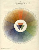
Newton's Color Circle
 Artists and designers who use color circles today often refer to Isaac Newton as the initiator of that form of color display. Newton took the bar of colors created by the passage of light through a prism and transformed it into a segmented circle, where the size of each segment differed according to his calculations of its wavelength and of its corresponding width in the spectrum. The placement and size of the colored sections of Newton's circle suggested other mathematical and harmonic relationships. The creation of this circle—or rather, the association of the color circle with the name of a genius—encouraged development of the color circle as a display system, validating its connection to the sciences, especially mathematics and optics. reference In asserting that the number of colors remained unchanged despite refraction, Newton indicated a direction for researchers interested in finding a solution to the puzzle of how many colors there are in the world. His color circle was acknowledged or built upon in many subsequent studies of color, whether their purpose was to confirm his points of view or to challenge them.
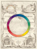
An Early Eighteenth-century Color Wheel
45 Two color circles are included as illustrations in the 1708 edition of Traité de la peinture en mignature, an artist's manual attributed to "C.B." (often assumed to be Claude Boutet, or the publisher, Christophe Ballard).18 Connections between Newtonian theories about color and this pair of circles are apparent in the design and the accompanying text. It is less clear, however, whether those theories were a direct source of inspiration. The first circle contains seven colors, violet, blue, green, yellow, orange, scarlet, and crimson. A second circle adds golden yellow, red, purple, sea green and yellow-green for a total of twelve colors. Overall, their inclusion is somewhat mysterious. The treatise had been issued in at least five editions without this portion; the color circles and the accompanying text appear only intermittently in later editions.19
The author of the accompanying text defined primitive colors, like Mayer's pure colors, as those that cannot be made from a mixture. He identified three: red, yellow, and blue. Black and white are not proper colors, he further stated, because white is light and black is the absence of light. This description was unusual in an artist's manual of the time but as a direct link to Newton, not among scientific or philosophical works. At the same time however, the colors used in the circles acknowledge a problem of color definitions, one based in artists' practices and perceptions. Red is acknowledged as a primitive color, but both scarlet and crimson are red colors, and both can be made from a single pigment. If both scarlet and crimson are red colors and both are primitive, then true red must be an equal mixture of crimson and scarlet. Therefore true red is not, by definition, a pure color, and it is not one in this system. This discrepancy in names and definitions is noted in other discussions of pure and mixed colors. It is clearly based in beliefs held by many artisans, but is not resolved in the Traité de la peinture en mignature or in any other eighteenth-century document. The difference is a critical one for the conceptualization of the number of colors by artisans and by natural historians or philosophers, but it is one barely mentioned by the latter groups. Newton's distinction between blue and indigo created a similar problem for nomenclature and for visual balance of the color circle and it likewise is rarely addressed.20
The physical format of "C.B."'s circle, and of circles more generally, offered consumers information about color and color relationships that was difficult to procure from charts or linear graphs. Waller's table showed which two colors could be mixed to create a third color. Mayer's triangle indicated the same information with three colors. The circle could simplify painting practices, because it is a convenient display tool for painters who wish to prepare or to choose colors. It could suggest mixtures and a few other relationships among its constituents. The circle demonstrates the adage that colors next to each other do not make visually pleasant pairs. It shows that the chromatic complements—blue and orange, red and green, yellow and purple—are more attractive combinations. The arrangement of colors on the circle also indicates the appropriate colors to use when painting highlights or shadows. Such explicit connections between the visual system and practices were important for the novice painter, exactly the consumer who might have purchased this book.
Louis-Bertrand Castel–Circles and Spirals
M. Newton en mesurant l'espace qu'occupent les couleurs au nombre de sept qu'il a comptées dans l'Arc-en-Ciel, pouvant, s'il l'avoit voulu, y en compter bien d'avantage, a trouvé ces espaces relativement égaux à ceux des cordes qui sonnent les sons du systême mineur de la musique, la, si, ut, re, &c. Voilà toute l'analogie que ce grand Géometre a jamais trouvée entre les sons & les couleurs ; à quoi va de cette analogie, & d'où vient-elle? je n'en sçais rien.
Louis-Bertrand Castel, L'Optique des couleurs. . . (Paris, 1740), 161–2.
Although an excellent didactic system, the color wheel was less useful as a system of classification, as it could not include more than the most basic collection of colors. Still, the range of scientific and artistic variations to this form was significant. About mid-century, Louis-Bertrand Castel created a color wheel based in his beliefs about color as a combination of light and shadow (chiaroscuro) and about analogies between color and sound. Castel began with a calculation to determine the number of colors in the rainbow.21 Newton's seven principal colors were not enough; Castel found at least a thousand, perhaps more. It would be impossible to differentiate among them such a large number of colors in a circle of any practical size. Moreover, Castel suggested, his use of the color circle was merely a convenient substitute for the color spiral, a shape that provided a more accurate display system. The spiral could incorporate increasing paleness or darkness along a series of colors, as if they were octaves, but it required a three-dimensional space that Castel could not recreate effectively on a two-dimensional page.
In L'Optique des couleurs (1740), Castel explained the twelve colors he chose to include in his circle. This increase in the number of colors displayed in a single color wheel solved the problem that extra blues or extra reds created in Newton's and "C. B"'s seven-color systems, but that was not one of Castel's specific goals. Castel's choice of twelve colors, and his choice of colors to include, was more closely related to related to the twelve tones of the musical scale. Clarification of the relationship between color and sound, occupied Castel for many years, especially his plans for and construction of an occular harpsichord, an instrument to play color as a harpsichord plays sound.22 reference
50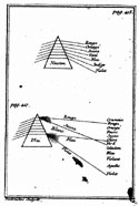 Other important factors in Castel's design were his fervid anti-Newtonianism and his conviction that a specifically French science existed as did a specifically French music and a specifically French art.23 Castel declared that Newton's hypotheses were inadequate, as they gave primacy to mathematical descriptions: Castel believed that his system was better because it began with observation and rational thought. He relied on mathematics too, but believed it should support contemplation and experience rather than direct them.
Castel's color system is an example, and not an isolated one, of an effort to develop color studies into a unified theory where the result would prove or disprove Newton. reference His investigations are a source for interesting themes, including expanded interpretations of chiaroscuro techniques, and his examples of joining of natural philosophy in social and political worlds. Castel's philosophical work contributed little to new conceptualizations of color and its systems however. It was never an important tool for artisans, musicians, or manufacturers and the details of his philosophy had few adherents. The greatest significance for Castel's color circle seems to have been as an example for inventors of other color circles. We know, for example, that it was extremely important to Ignaz Schiffermüller's conceptualization of color order and display.
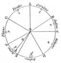
Other Color Circles: Ignaz Schiffermüller
Nicht wenige Naturforscher äußerten schon lange den Wunsch, daß bey itzigen der Naturwissenschaft so günstigen Zeiten auch hierinn ein Mittel möchte getroffen, und die wankenden Benennungen der Farben auf solche Art bestimmet werden, daß unsere Begriffe davon allgemein und einförmig würden.
I. Schiffermüller, Versuch eines Farbensystems, (Vienna, 1772), 1.
An entomologist, Ignaz Schiffermüller wished to create a more nuanced color wheel, one that would express the logical connections, described by Castel, between musical and chromatic harmonies but that would also prove useful in practical endeavors, including natural-history classification and color production.24
Schiffermüller mentioned both Castel and Mayer as influences and his treatise, Versuch eines Farbensystems, (1772) is full of references to other experts, from Pliny and Virgil to Johannes Winckelmann, Leonhard Euler, Anselmus de Boodt, and a number of his acquaintances. reference
Schiffermüller in his treatise explains how he came to decide on the details of his form. They were, he claimed, based on reading, discussions with local artists, and his own thoughts and experiences. He described how his color wheel differed from Newton's circle. Newton's color circle related the area of each color to wavelength and other measurements, and the sizes of the color compartments varied: Schiffermüller preferred to give each color an equally-sized segment on his wheel. He adopted several conventions proposed by Castel into his system of color classification and display, including the use of twelve colors.
55| The colors of Schiffermüller's wheel | ||
|---|---|---|
| Blue | Yellow | Carmine |
| Sea green | Orange yellow | Violet red |
| Green | Fire red | Violet blue |
| Olive green | Red | Fire blue |
 The twelve colors of Schiffermüller's color wheel included the three primaries, the secondaries formed by their combination, and six tertiary colors. He named carmine as the primary red and placed scarlet (fire-red) and true red in secondary and tertiary positions. This organization further acknowledges an understanding of later eighteenth-century production techniques for each red color, as scarlet colors were frequently enhanced by the addition of yellow. reference Red, the combination of scarlet and carmine, would then be a tertiary color rather than a secondary. Adopting these conventions, Schiffermüller could then characterize the placement of color in his circle as a having regular rhythm (primary, tertiary, secondary, tertiary).
In describing his objectives for creating the color circle, Schiffermüller noted his desire to strengthen links between the understanding of color in different fields—natural history, natural philosophy, and artisan practice—and to contribute to the integration of the study of color with a larger continuum of ideas. He claimed a broad potential audience for his work: artists, artisans, entomologists, mineralogists and other scientists, experts on painting, amateurs of the arts, and the general public. Like many others with the same goals, he assumed that there is a knowable natural order to color, one that would confirm the relationship among all forms of knowledge. Accordingly, his writing includes comments on dyestuffs as well as on painters' practices in oil, pastel, and enamel. The wheel is clearly not enough to express all that Schiffermüller hoped to tell, however. Inspired perhaps by Schäffer's publication, he advocated charts as a means to expound each of the principal colors. He chose blue, his first color, to demonstrate this part of his system. Mimicking the numbers of Mayer's triangle, but not the reasoning behind it, Schiffermüller identified twelve categories to each color on his circle.  The series, labeled A through M, shows the range of colors from bluish white through blue-black. A color can exist, however, in different gradations of light without alteration to its nature or its name. Within each species are shades, a bright or pale state and a dark or deep state, as well as the original. There are, then, 432 colors (12 x 12 x 3) in Schiffermüller's color system.
Schiffermüller's concern with names of colors is evident in the notes about species of color. reference He did not invent names nor did he attempt to standardize those he used. Instead, Schiffermüller listed the common name for each shade of the blue species, adding the Latin and French terms for many. As a further assurance of accuracy, each shade included within each chart is labeled a, b, or c, and each can be identified succinctly according to its coordinates. We have seen this technique to identify shades without recourse to names elsewhere, in Mayer's triangles and Schäffer's charts. It seems to solve a major problem in the use of display techniques for the universal transmission of information, as the position of a color can be determined independent of any local or common name.
^topThe Usefulness of Charts and Circles, Combined
Having outlined the creation of the wheel and chart, and having established its methodological and philosophical validity through copious references, Schiffermüller devoted the remaining chapters of his work to situations in which the system could prove useful. He explained the general rules of color composition in fresco, enamel, and pastel painting, showing how to use his wheel and chart together as a tool to select the appropriate color combinations for each technique. Color selection has two parts: First judge and choose the appropriate color combinations from the wheel, and then choose the best shades from the charts. For Schiffermüller, chromatic harmony and musical harmony are as strongly analogous as they were for Castel. Just as playing the sound of two notes adjacent on the scale is infelicitous, so are two colors next to each other on the color wheel unattractive. Better harmony and so the most pleasant visual effect comes from colors separated by two other colors. Carmine, purple (violet-red), and violet-blue look better next to blue than either green or fire blue.
 Schiffermüller applied his system to textiles, making connections between the use of color in those practices and the uses of color in painting. An understanding of color mixture, as he explained, is important to the construction of soies changeant (shot silk), fabrics in which warp and weft of two different colors combine visually to create a third.25 Again, successful examples were those that produced a beautiful combination, and certain combinations—identifiable by the positions of the colors on the wheel—would create an ugly result. Drawing an analogy to pigments that lose glossiness when desaturated, Schiffermüller suggested that the cloth in question would similarly lack iridescence. The most beautiful shot silks are made with warps and wefts of two different colors that combine to form a pleasant and recognizable third—yellow and blue combined to form green, perhaps, or blue and red to form purple. Time and expense could be saved, Schiffermüller suggested, if his system were consulted to select appropriate colors.
Filling in the Color Wheel
60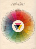 Moses Harris, a British entomologist and approximate contemporary of Jacob Christian Schäffer, created still another circular display system for colors.26 In The Natural System of Colours, Harris crafted a circle that expanded the color relationships depicted in other circle-based systems. He divided the circle into arced segments to show, in a single format, not only pure colors but also shades and tones. The twentieth-century color scientist and historian of color Faber Birren found in Harris's color circles a prediction of color systems advocated in the later nineteenth and in the twentieth centuries.27 Although Harris's graded color circle is a two-dimensional representation, it is easy to imagine it as an antecedent to the three-dimensional graph in which numerical coordinates scale red to green, blue to yellow, light to dark—the modern CIE system defining hue, saturation, and luminous intensity. Web Link reference
A single image is easier to manipulate than a collection of charts and thus Harris's form may have been a more practical tool in any situation. The presence of all colors on one page simplified matching color to sample and recognizing relationships among colors. According to Harris, however, these practical applications of his color circle were less important than its role in tying specific colors to a standard vocabulary.
^topThe Order of Harris's Circle
If the colours were divided into a greater number of teints or divisions, which it is conceived is all that can be done in attempting to improve [the system], it would not render it more useful, but rather tend to create confusion between the teints which are now but sufficiently conspicuous; and would be one step toward reducing it to its premative chaos, from which the author has taken so much pains to extricate it.
Moses Harris, Natural System of Colours (London, 1766), 6.
Harris presented his circle as a demonstration of the theory that all colors are formed from red, blue, and yellow, but the circle is based on a prismatic sequence of six colors rather than on the artists' primaries. He resolves the numerical discrepancy (three primaries, six colors) by designating two types of principal color. Red, blue, and yellow are grand principals; orange, green, and violet are compound principals.
 Harris claimed that this organizational methodology was the result of his examination of colors in nature, further informed by his prism studies. Like "C. B.," he used two wheels to present all colors, but with the same number of segments in each. Relationships between colors and between shades of colors were clear and calculable in Harris's color system. It defined color contrasts and their implications for the production of visual combinations and mixtures. Harris's system, like Schiffermüller's, placed each color 180° from its complement, a physical location that highlighted both internal and external relationships among colors.
The transmission of color information depends on precise language as well as on visual forms and the use of recognizable, standard practices.28 Harris insisted that perfect colors such as those in his prismatic circle should be described by words that mean nothing but that color: Compound or secondary colors might include a modifier that had other meanings, however. Between each principal color are two mediates; for example, one sequence would be red (principal color), red-orange (mediate), orange-red (mediate), orange (principal). Each color is further divided in thirds. Red, blue, and yellow each equal three-thirds of their respective color. Orange-red would be two parts red to one orange, red orange one part red to two orange, continuing around the circle. The compound colors would be treated similarly but, as Harris described them, the grand primitives would each have six parts. Orange is made from equal parts red and yellow, each made of three parts. Green is made from three parts blue and three parts yellow. Olive, the color midway between the two is made from three parts each of blue and red and six parts yellow (equivalent to one each blue and red, and two yellow).
65Harris's calculations led him to devise a circle with eighteen segments, each numbered, so colors could be identified by a name-number pair. Within the circle, each segment has 20 degrees—degrees meaning both the measurement of distance in a circle and a segment of the circle—ordered according to the lightness of the color contained. Furthermore, with eighteen segments, each having 20 degrees, there are 360 colors to Harris' principal color circle. This is a number with obvious connections to geometry. The strongest colors—i.e., the most saturated—are at the center, physically closest to each other. The colors at their weakest power, those outermost on the circle, will create white, he asserted. Yet his circle does not depict these very palest of pale colors, and he made no direct claims for the properties of the constituents of the outermost ring.
To identify all colors, however, one had to consider those that resulted from mixtures of prismatic colors beyond this first ring. This was a rationale for the second color circle, a circle made from the secondary and tertiary colors green, olave [sic], orange, brown, purple, and slate. The form of this circle was identical to that of the principal color circle, with eighteen segments having twenty parts each or 360 colors. Orange, green, and purple were also found in the first circle, however, and so the total number of new colors in this circle was 300, not 360. Harris, then, presented 660 different colors arranged in 33 groups.
^topBlack and White in Harris's Color System
That appearance which is in general term'd black, is a compound of red, blue and yellow, in equal force, and of the strongest powers, which by violently opposing each other, in very unequal contest, (for as each one has to contend with the other two,) are all three continually defeated, causing a total confusion and an obscurity in darkness, so that neither of them can be any more distinguished.
Moses Harris, Natural System of Colours (London, 1766), 4.
Harris accommodated certain aspects of Newtonian color theories in his system; although he dropped indigo (not a unique color name) from his presentation he otherwise maintained Newton's colors and basic aspects of their interrelationships. A significant feature of Harris's system is his effort to incorporate the effects of darkness and lightness on color into the color circles rather than treat them separately. Harris recognized that in practices white and black are not opposites, as both are created on objects through a process. reference The shift to a description of the colors of objects fully integrated with the definition of colors of light was not possible. Harris relied on the common definition of black as the mixture of all colors in his explanation. Nevertheless, he formed a description that more closely aligned the two definitions of black. When the three grand principal colors are mixed, Harris asserted, they work in opposition and destroy each other, becoming indistinguishable. The result is confusion rather than color. Harris can make no parallel accommodation for white however. He states only that in objects, white is the lack or absence of color, while in Newton's system white is considered a color because it is the perfect combination of all colors. His model for this statement may have been the dilution of colored tinctures also described by Lichtenberg. As with Lichtenberg's system and those devised by several others, Harris relies on the paper substrate to create whiteness.
Harris further acknowledged that certain colors in artisan practices and the natural world could not be found in his visual system. He identified these missing colors as those that do not become darker as you add more layers. reference They are imperfect colors, a definition that parallels one formulated by Tobias Mayer. Harris's acknowledgement of imperfect colors is almost certainly derived from his experience with natural-history illustration, where the color washes he recommended to recreate his system were common coloring materials. Layering washes was a typical method to create darker shades. reference
^topTwo Dimensions to Three
Systems that required more than one form to display all colors were cumbersome to use, and they seemed to contradict the underlying premise of a unified, stable, and simple organization for color. Although concrete display devices, these systems could express only a few of the possible relationships among colors. No two-dimensional form devised in the eighteenth century ever satisfied the belief that the logical combination of the science of color and the art of color would simplify, explain, and enhance both through a single classification system. As an alternative, a geometric solid or a shape approaching a solid might offer a more complete enumeration of all the colors in the world, as it demonstrated color theories and physically located relationships between different colors.
70
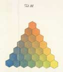
Das Wachs ist ursprünglich aus dem Pflanzenreich. In einigen besonders Americanischen Pflanzen findent man es, wie wohl in einem geringern Grad von Güte, schon so zubereitet, daß es vermittelst warmen Wassers an ausgezogen werden.
Johann Heinrich Lambert, Beschreibung einer . . . Farbenpyramide (Berlin, 1772), 47 §44.
In general the three-dimensional images devised in the eighteenth century were not signifiantly better than than the lines, circles, or trianglest. For several reasons, however, Johann Heinrich Lambert's adaptation of Tobias Mayer's triangle is worth closer consideration.29 Building on a scientifically rational two-dimensional system, Lambert used his own studies of perspective to explode the triangle into a three-dimensional pyramid. His system includes fewer colors but, as with Werner's system, Lambert's form acknowledges visible space in which the viewer can imagine additions. And finally, Lambert experimented with color media, recommending encaustic reference colors to create the image of his system, in part to avoid the desaturation and incompatibility problems that arose when creating a system from pigments in water, gouache, or oil. The distinctive features of Lambert's system take on additional meaning when considered in the context of his other interests, his role as one of the foremost members at the Berlin Academy, his use of graphs as an explanatory tool in the scientific papers he published, and his engagement with the materials appropriate to create the color display he designed.
In Beschreibung einer. . . Farbenpyramide (1772), Lambert presented theoretical and practical aspects of colors as integrated entities. In this aspect, the system follows the convention of most contemporary color classification systems. Lambert discusses Newton and Newton's optical writings related to color, which for him did not create the philosophical conflicts they did for Castel and others. Lambert's engagement with Newton in the design of his color system began with Newton's mathematized approach. Like Castel and like Mayer, Lambert was enamored of the numerology of color and his explanations combine the two. He discusses the interval and the frequency of each of the seven colors of the Newtonian spectrum, and through those relationships connects them to music and musical harmonies.
Lambert's effort to determine the appropriate coloring materials strongly influenced the creation of his color pyramid. The relationship among mixed colors, he noted, varies according to the substances used and so understanding those substances is essential to the creation of a good color system. Tobias Mayer had searched for basic colors that gleam the most: Lambert used the same criterion, the saturation or strength of the color, as the factor governing his choice. He stipulated, as other inventors had, that the appropriate colors should be balanced, quantifiably as well as visually, to ensure the appropriate mixture. Any color should have a comparable effect on all others, an important characteristic within a visual color classification or display system.
To determine the best choice of pigment and medium, Lambert analyzed the materials advocated by others. He referred to the display systems of Schäffer and Schiffermüller and to Jacob Christoph Le Blon's three-color printing technique, which Lambert considered a notable application of three-color theory. reference The limitations of many systems of color classification were the result of research that concentrated on the mixture of colors found in nature rather than on colors that the mixing of pigments makes possible, Lambert decided. This observation, validated by the cases of Schäffer, Schiffermüller and Werner, suggests Lambert's awareness of the need to engage artists' experience and understanding more directly in the production of a workable universal color system. His recognition of this need poses a significant question for all efforts to create a unified and cohesive display. Where should this combination of art and the sciences begin? Lambert's attitude was unusual in that he was willing to place artisan knowledge alongside or even above his own expertise. For Lambert, this work began in the painter's workshop, not the natural-historian's cabinet, and it moved from there to the chemist's or physicist's laboratory, and the mathematician's study.
Lambert's précis of earlier efforts to systematize color considers their forms as well as their materials and he builds an argument for basing his own system on the triangular shape used by Tobias Mayer. He cites descriptions of Mayer's triangle published in Göttingischen Anzeigen, in Sulzer's Allgemeine Theorie der schönen Künste and in other publications. He notes his own references to Mayer's triangle in an article published in the Mémoires de l'Académie royale de Berlin, in which he discussed the juncture of sciences and art, and concluded that their combination was clearly valuable to both.30 reference
75Lambert chose the same base colors—cinnabar, gamboge, and azurite—as Mayer had recommended. While Mayer had not specified the medium he used, we assume from Lichtenberg and others that it was water, perhaps a gouache or body color. Lambert advocated an encaustic wax invented by the Berlin-based painter Benjamin Calau: he believed that Calau's wax successfully addressed the issues of color stability while meeting the requirements of transparency that would facilitate readable mixtures, both typical claims for encaustic media at that time. Lambert further implied a symbolic significance to Calau's wax based on its composition. The formula required some special ingredients imported from America so, although the inventor compared it to materials of the ancient world, it was a new and modern substance, better suited to solve modern problems. reference Thus, the use of pigments in this medium—the materials that literally made Lambert's pyramid—shared practical, historical and aesthetic levels of meaning with Lambert's color display system as a whole.
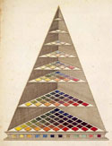 Lambert's pyramid reiterated and strengthened many of the claims about color relationships and color display systems made for Mayer's system. Despite some superficial correspondences, however, the form and construction of Lambert's pyramid and his recommendations for its use suggest that he had a substantially different vision of the solution to the problems involved in the ordering and display of color. The construction of Lambert's system, as he indicated, was made more cohesive by his own work in perspective. He used the mathematics outlined in Photometria (1760) and other writing to design, for his system, triangular platforms of varying but regular sizes that fit within a pyramid shape. For the treatise, each platform is positioned to display its contents with minimal foreshortening: the result is an unfaithful representation of a pyramid, but a better didactic tool.
An Explanation of Lambert's Pyramid
Although Lambert in his treatise moves from the largest (lowest) section of the pyramid to the smallest and uppermost as he describes its construction, the viewer must work down from the top of the structure as drawn to understand its philosophical grounding: The form represents the break-up of color from coherent Newtonian light. At the same time, each platform within the pyramid contains a group of colors that demonstrates a significant aspect of the theories of color and color combination.
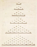 Imagine that light enters the pyramid through a small hole at the top. It shines first on the uppermost platform, which has no colored squares—it is pure light. At the second level, there is one white square. The third platform holds the basic colors—red, yellow, and blue. The fourth includes those three primary colors separated by the appropriate secondary, orange between red and yellow, green between yellow and blue, violet between red and blue. Newton's seven prismatic colors line the edges of the next triangle: the middle squares contain colors made from their mixture. The triangle formed on the next-largest platform, sixth from the top, features the twelve basic colors: primaries, secondaries, and tertiaries. Interior colors here, Lambert notes, are all brownish shades, the result of mixing the basic colors. The triangle of colors on the seventh platform further separates the three primary colors from their secondaries and tertiaries, interjecting more combinations between. The largest table at the bottom has forty-five colors, nine per side, mixed according to the same proportional method advocated by Mayer.
Lambert describes a color space that is significantly different from all others discussed here. His color system is based on artistic understanding of light rather than the prismatic colors used in wheels or bars of color, or the artist-based trichromatic theories that inspired Mayer, although he includes them both in his form. Lambert's system incorporates tints and shades, the pale and dark colors, into his single display. The colors increase in intensity as they move down the pyramid and away from the light source. To anyone who has experimented with light passed through a prism, it seems counterintuitive to draw colors as if they become more intense the further they are from the light source. Shouldn't they become increasingly pale or indistinct? To understand Lambert's form, you need to consider the aesthetic theories of chiaroscuro and, like encaustic painting techniques, their position in eighteenth-century art. In chiaroscuro theories, colors further from a light source appear darker than they do as they approach that source. This convention allowed Lambert to indicate variations for each color, and suggest a relationship between the position of light and the subtleties of color. He incorporated shades and tones into a single form in a way that Mayer's triangle could not, and expressed connections to artisan practices that color circles such as Harris's ignored. Lambert's pyramid combines practices with theories in ways that are substantially different from other attempts to delineate their relationship for color, yet his is still not a fully workable system for either artisan or philosopher. Although one can imagine the pyramid continuing with ever larger and darker triangles, and the existence of platforms between those Lambert included, it contains too few colors to establish all the colors in the world. An imaginative presentation, still it requires imagination to make it truly useful.
^topVisualization, Systematization, Order, and Meaning for Color (or, What Is Art, to a Scientist?)
80
Selinde will ein Kleid wie Caroline haben. Sie bemerkt sich das No. und den Triangel, wo die Farbe vorkömmt, und ist sicher, daß sie die gleiche Farbe treffen wird. Soll sie dunkler oder heller seyn, oder mehr auf eine andere Farbe ziehen, so wird auch dieses keine Mühe geben.
Johann Heinrich Lambert, Beschreibung einer . . . Farbenpyramide (Berlin, 1772), 109 §121.
At the beginning of this section, I suggested that eighteenth-century natural historians and natural philosophers believed that, similar to systems of natural-history classification, a universally applicable system for color could be created. The advantages of such a system were obvious. A color classification system could be used to calculate or prove the number of colors in the world. The correct system would standardize nomenclature. The best presentation of the best system might resolve the differences between the colors of light and the colors in objects. Science could use art to aid the arts and commerce. As Johann Heinrich Lambert and others suggested, a comprehensive display of colors (his, for example) would reassure manufacturers and merchants that they offered their customers the correct products—those with colors or color combinations that were in demand. It was typical for the inventor of a visual display system to tout its practical value as well as its philosophical grounding. Possession of the correct color classification system would allow one to predict results in the workshop and to direct production choices in manufacturing, whether the product was painted, fired, or dyed. Universal acceptance of a color classification system would facilitate transfer of information among practitioners in far-flung regions and otherwise disparate fields.
Or at least this was the plan. Integrating the many ideas about the nature of color into a concise visual form proved more difficult than the proponents of any one system could have predicted. The conventions of standardization were and were not an aid. The flexible understanding of color within a precisely-defined vocabulary moved certain colors—or certain ideas about colors—into a classification limbo that had no relation to their uses and usefulness. Different concerns and approaches in artisan practices meant that basic information was difficult to quantify in ways useful and acceptable—or even recognizable—to philosophers. The result was often the employment of techniques and skills without sufficient knowledge about the aspects that made them distinctive, and this opened those practices to misinterpretation. Schäffer assumed, in his recommendations for color mixtures, that natural history specimens familiar to him were consistent and consistently available. Yet the systems that attempted to be universal from the start, to discuss only what might remain stable as it was transmitted or to incorporate all ideas of color into a single unified system, were no better. Whether the starting point was the artists' color triad or a series chosen by external criteria—the prism, harmonic theories, close reading of ancient masters, or collections of objects—no inventor was able to contain all colors or express all their meanings in a single form.
The effort to create a unified color display system can be understood as the kind of broad, public venture that is so much a part of eighteenth century rhetoric, and was so much a part of eighteenth century life. Despite the widespread effort and variety of systems proposed, the collected result of these attempts by scientists was at best only adequate. The difficulties of creating a universal ordering system that explains science through the use of art amplified their differences. If the practical value of any visual system lay in its ability to place all colors within it, the most successful forms were those that were the least concrete, and so required the greatest imagination to understand.
What is art, to the sciences? Art offers the tools to express visually what is understood conceptually. Graphs, circles, bars, and triangles suggested a cohesiveness to color in all its manifestations that eighteenth century understanding could never supply. While color display systems enhanced the perception of color as a scientific entity, the connection to art and the use of artistic practices remained problematic. Numbers and logic could not explain everything that happened in a workshop. Artisans could make similar looking colors from different materials—indigo and Prussian blue, for example—but the two colors might be the same only superficially and under certain conditions. Most obviously, they might look different in different media or when combined with other colors, or they might age differently. This shifting correspondence—the understanding of which was at the heart of artisan skill—could not be explained systematically or accommodated scientifically in the eighteenth century. These problems were not solved by strict adherence to a limited vocabulary, as the natural historians believed, nor by the substitution of numbers for words, a practice common among mathematicians and physicists. The irregularity or randomness of art defeated many philosophical systems that attempted to make a science from art.
The color ordering systems I have presented show how certain savants used their understanding of the sciences and of art to emphasize different physical forms or highlight different underlying theories. Their approaches, as we would expect, were mediated by experience. For so many reasons, a turn to art provided no comprehensive answers to questions about color, and so the questions remained, the answers tantalizingly close and the endeavor to grasp them frustrating because, ultimately, color proved impossible to control.
^topNotes:
Note 1: See, for example, "Virtual Colour Museum," at www.colorsystem.com; Mauro Boscarol, "Storia della Colorimetria," at http://www.boscarol.com/blog/?page_id=11084, Michael Douma, "Causes of Color," WebExhibits Virtual Museum, at http://webexhibits.org/causesofcolor; José Luis Caivano, "Chronological Bibliography on Color Theory," at http://www.fadu.uba.ar/sicyt/color/bib1.htm (accessed 15 November 2005). back
Note 2: Other discussions of these forms as a group can be found in the following: John Gage, Color and Culture: Practice and Meaning from Antiquity to Abstraction (Boston, 1993); Martin Kemp, The Science of Art: Optical Themes in Western Art from Brunelleschi to Seurat (New Haven, 1990); Robert Feller and Charles Parkhurst, "Who Invented the Color Wheel?" COLOR Research and Application 7, no. 3 (1982): 217–30; Rolf G. Kuehni, "What the Educated Person Knew about Color, a.d.1700," COLOR Research and Application 6, no. 3 (1981): 228–32; Rolf G. Kuehni, Color Space and Its Divisions: Color Order from Antiquity to the Present (Hoboken, N.J., 2003). back
Note 3: Laura Tilling, "Early Experimental Graphs," British Journal for the History of Science 8 (1972): 193–213. back
Note 4: Richard Waller, "A Catalogue of Simple and Mixt Colours with a Specimen of Each Colour Prefixt to its Proper Name," Philosophical Transactions 16 (1688): 24–32. back
Note 5: Jacob Christian Schäffer, Entwurf einer allgemeinen Farbenverein oder Versuch und Muster einer gemeinnütslichen Bestimmung und Benennung der Farben (Regensburg, 1769), 1. back
Note 6: Schäffer, Entwurf einer allgemeinen Farbenverein, 19–22 and Appendix 2. back
Note 7: Jacob Christian Schäffer, Zweifel und Schwürigkeiten welche in der Insectenlehre annoch vorwalten (Regensburg, 1766). back
Note 8: Schäffer, "Neunte und letzte Regel," Entwurf einer allgemeinen Farbenverein, 16–8. back
Note 9: Abraham Gottlob Werner, "Erklärungen der äußern Kennzeichen der Foßilien: Die Farbe," in Von den äußerlichen Kennzeichen der Foßilien, abgefaßt von Abraham Gottlob Werner, der Bergwerks-Wissenschaften und Rechte beflißenen, auch der Leipziger öconomischen Gesellschaft Ehren-Mitglied (Leipzig, 1774), 87–137. back
Note 10: The best-known of these is Werner's Nomenclature of Colours With Additions, Arranged So As To Render It Highly Useful to the Arts and Sciences, Particularly Zoology, Botany, Chemistry, Minerology, and Morbid Anatomy, by Patrick Syme (Edinburgh, 1814). back
Note 11: Abraham Gottlob Werner, "Explication of the External Characters of Fossils: The Colour," in A Treatise on the External Characters of Fossils. Translated from the German of Abraham Gottlob Werner, Counsellor of Mines, Professor of Mineralogy, Public Teacher of the Art of Mining in the Mine-Academy of Freyberg, and Member of Several Learned Societies trans. and ed. Thomas Weaver (Dublin, 1805): 36–72. back
Note 12: Werner, "Erklärungen der äußern Kennzeichen der Foßilien: Die Farbe," 132. back
Note 13: Tobias Mayer, "Von Meßung der Farben," Göttingische Anzeigen 2, no. 147 (1758): 1385–9. back
Note 14: Tobias Mayer, "On the Relationships Between Colors," trans. Adriana Fiorentini, commentary by Barry B. Lee, COLOR Research and Application 25, no. 1 (2000): 66–74; Tobias Mayer, "Treatise on the Relationship of Colours (1758)," Tobias Mayer's Opera Inedita, ed. Eric G. Forbes (London, 1971); Eric G. Forbes, "Tobias Mayer's Theory of Colour-Mixing and Its Application to Artistic Reproduction," Annals of Science 26 (1970): 95–114. back
Note 15: Tobias Mayer, . . . Opera inedita Vol. I. Commentationes Societati Regiae scientiarvm oblates . . ., trans. and ed. Georg Christoph Lichtenberg (Göttingen, 1775); Tobias Mayer's Opera Inedita, ed. Eric G. Forbes (London, 1971). back
Note 16: Ralph Mayer, The Artist's Handbook of Materials and Techniques, rev. ed. (New York, 1957), 54 (gamboge), 76 (vermilion). back
Note 17: Gage, Color and Culture, esp. 162; Parkhurst and Feller, "Who Invented the Color Wheel?" back
Note 18: [C.B.], Traité de la peinture en mignature (The Hague, 1708). back
Note 19: Ann Massing, "Painting Materials and Techniques: Towards a Bibliography of the French Literature before 1800," in Die Kunst und ihre Erhaltung: Rolf E. Straub zum 70. Geburtstag Gewidmet (Worms, Germany, 1990): 57–96. back
Note 20: George Biernson, "Why Did Newton See Indigo in the Spectrum?" American Journal of Physics 40 (1972): 526–33; David Topper, "Newton on the Number of Colours in the Spectrum," Studies in the History and Philosophy of Science 21 (1990): 269–79. back
Note 21: Louis-Bertrand Castel, L'Optique des couleurs: Fondée sur les simples observations, & tournée sur-tout à la pratique de la peinture, de la teinture & des autres arts coloristes(Paris, 1740). back
Note 22: Roland Mortier and Hervé Hasquin, eds. "Autour du père Castel et du Clavecin Oculaire," Études sur le XVIIIe Siècle 23 (1995); Thomas L. Hankins, "The Ocular Harpsichord of Louis-Bertrand Castel; or, The Instrument that Wasn't," in Instruments and the Imagination, eds. Thomas L. Hankins and Robert J. Silverman (Princeton, N.J., 1995): 72–85. back
Note 23: Donald S. Schier, Louis Bertrand Castel, anti-Newtonian Scientist (Cedar Rapids, Iowa, 1941). back
Note 24: Ignaz Schiffermüller, Versuch eines Farbensystems (Vienna, 1772). back
Note 25: Schiffermüller, Versuch eines Farbensystems, 17–18 back
Note 26: Moses Harris, The Natural System of Colours, Wherein Is Displayed The Regular and Beautiful Order and Arrangement, Arising from the Three Primitives, Red, Blue, and Yellow, The Manner in Which Each Colour Is Formed, and its Composition, The Dependance They Have On Each Other, and By Their Harmonious Connections Are Produced the Teints, or Colours, of Every Object in the Creation, and Those Teints, Tho' So Numerous as 660, Are All Comprised in Thirty Three Terms, Only (London, [1766]). back
Note 27: Faber Birren, "Historical Notes and Commentary," in The Natural System of Colours by Moses Harris (1766), ed. Faber Birren (New York, 1963), n.p. back
Note 28: Harris, Natural System of Colours, 8. back
Note 29: Johann Heinrich Lambert, Beschreibung einer mit dem Calauschen Wachse ausgemalten Farbenpyramide, wo die Mischung jeder Farbe aus Weiß und drey Grundfarben angeordnet, dargelegt und derselben Berechnung und vielfacher Gebrauch gewiesen wird (Berlin, 1772). back
Note 30: Johann Heinrich Lambert, "Mémoire sur la Partie Photometrique de l'Art du Peintre," Mémoires de l'Académie royale de Berlin 1768 (Berlin, 1770), 80–108. back